SMALL
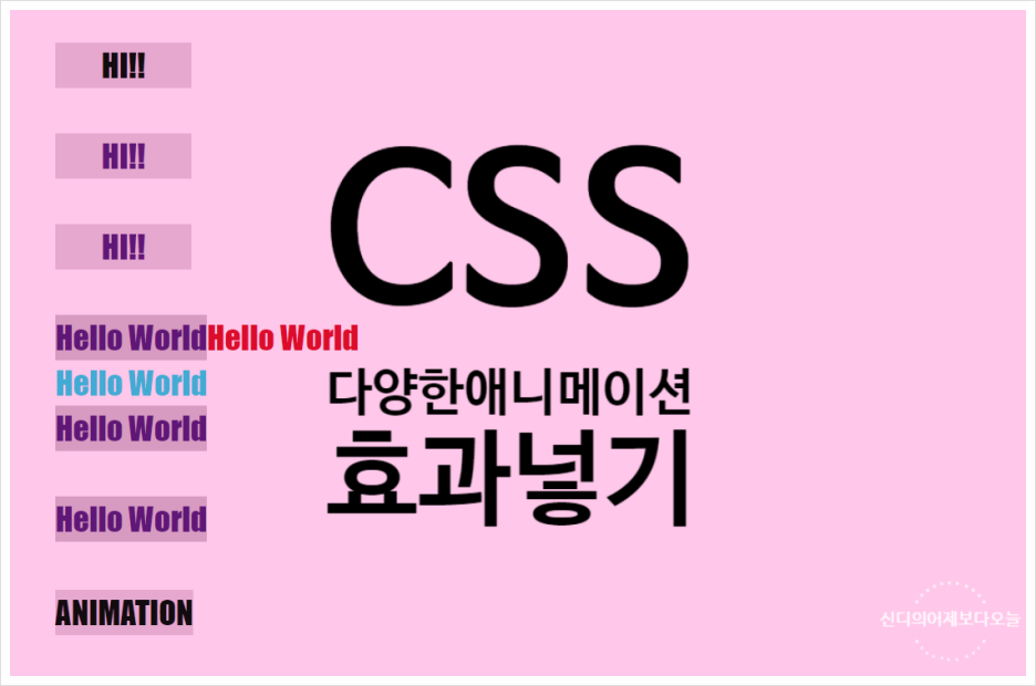
<body>
    <a href="" class="hi">HI!!</a>
    <div class="spacer"></div>
    <a href="" class="hi2">
        <span>HI!!</span>
    </a>
    <div class="spacer"></div>
    <a href="" class="hi3">
        <span>HI!!</span>
    </a>
    <div class="spacer"></div>
    <a href="" class="hi4">
        <span>HI!!</span>
    </a>
    <div class="spacer"></div>
    <a href="" class="hello">
        <span>Hello World</span>
    </a>
    <div class="spacer"></div>
    <a href="" class="hello2">
        <span>Hello World</span>
    </a>
    <div class="spacer"></div>
    <a href="" class="hello3">
        <span>Hello World</span>
    </a>
    <div class="spacer"></div>
    <a href="" class="mask">ANIMATION
        <span class="mask1">
            <span>ANIMATION</span>
        </span>
    </a>

</body>
<style>
* {
margin: 0;
padding:0;
}
*,
*::before,
*::after {
box-sizing: border-box;
}
body {
padding: 50px;
font-family: 'impact';
}
.spacer {
height: 50px;
}
a {
text-decoration: none;
}
.hi {
display: block;
width: 150px;
height: 50px;
text-align: center;
line-height: 50px;
background: #ddd;
color:#111;
font-size: 35px;
transition: all 0.3s ease-in-out;
}
.hi:hover {
color:#eee;
/* inset: 내부그림자 */
box-shadow:inset 150px 50px 0 #111;
}
.hi2 {
display: block;
width: 150px;
line-height: 50px;
font-size: 35px;
text-align: center;
color:#111;
background: #ddd;
position: relative;
overflow: hidden;
}
.hi2::before {
content: '';
width: 100%;
height: 100%;
position: absolute;
left:0; top:0;
background: #f30;
transform: translateX(-100%);
transition: transform 0.3s ease-in-out;
}
.hi2 span {
position: relative;
z-index: 100;
}
.hi2:hover::before {
transform: translateX(0);
}
.hi2:hover span {
color:#ddd;
}
.hi3 {
display: block;
width: 150px;
line-height: 50px;
text-align: center;
background: #ddd;
font-size: 35px;
position: relative;
}
.hi3::before {
content: '';
width: 100%;
height: 5px;
position: absolute;
left:0; bottom:0;
background: #111;
transform-origin: 0 50%;
transform: scaleX(0);
transition: transform 0.3s ease-in-out;
}
.hi3:hover::before {
transform: scaleX(1);
}
.hi4 {
display: block;
width: 150px;
line-height: 50px;
font-size: 35px;
background: #ddd;
text-align: center;
position: relative;
}
.hi4::before {
content: '';
width: 100%;
height: 5px;
background: #f30;
position: absolute;
left:0; bottom:0;
transform-origin: 100% 50%;
transform: scaleX(0);
transition: transform 0.4s ease-in-out;
}
.hi4:hover::before {
transform-origin: 0% 50%;
transform: scaleX(1);
}
.hello {
background-color: #ccc;
display: inline-block;
font-size: 35px;
line-height: 50px;
position: relative;
/* overflow: hidden; */
}
.hello::before {
content: 'Hello World';
position: absolute;
color:#f00;
transform: translateX(100%);
transition: transform 0.3s ease-in-out;
}
.hello span {
display: inline-block;
transition: transform 0.3s ease-in-out;
}
.hello:hover span {
transform: translateX(-100%);
}
.hello:hover::before {
transform: translateX(0);
}
.hello2 {
background-color: #ccc;
display: inline-block;
font-size: 35px;
line-height: 50px;
position: relative;
}
.hello2::before {
content: 'Hello World';
position: absolute;
top: -200%; left: 0;
color: aqua;
transform: translateY(100%);
}
.hello2 span {
display: block;
transition: transform 0.3s ease-in-out;
}
.hello2:hover span {
transform: translateY(100%);
}
.hello2:hover::before {
transform: translateY(200%);
}
.hello3 {
background-color: #ccc;
display: inline-block;
font-size: 35px;
line-height: 50px;
position: relative;
overflow: hidden;
}
.hello3::after {
content: 'Hello World';
color: #f00;
display: inline-block;
font-size: 35px;
line-height: 50px;
position: absolute;
left: -100%;
top: 0;
transition: all 0.2s ease-in-out;
}
.hello3:hover::after {
transform: translateX(100%);
}
.mask {
display: inline-block;
font-size: 35px;
line-height: 50px;
background-color: #ddd;
color: #111;
position: relative;
}
.mask .mask1 {
display: inline-block;
position: absolute;
left: 0; top: 0;
color: #f30;
transform: translateX(-100%);
overflow: hidden;
transition: transform 0.4s ease-in-out;
}
.mask .mask1 span {
display: inline-block;
transform: translateX(100%);
transition: transform 0.4s ease-in-out;
}
.mask:hover .mask1,
.mask:hover .mask1 span {
transform: none;
}
</style>LIST
'프론트엔드 개발자 > CSS' 카테고리의 다른 글
| CSS 애니메이션 효과 _ 카드박스 효과내기(2) (0) | 2023.04.07 |
|---|---|
| CSS 애니메이션 효과 _ 카드박스 효과내기(1) (0) | 2023.04.07 |
| CSS _ 애니메이션 연습(3)-(2) 3번의 변형형 (0) | 2023.04.05 |
| CSS _ 애니메이션 연습(3) (0) | 2023.04.05 |
| CSS _ 애니메이션 연습(2) (0) | 2023.04.05 |


댓글