SMALL
<body>
<div class="container">
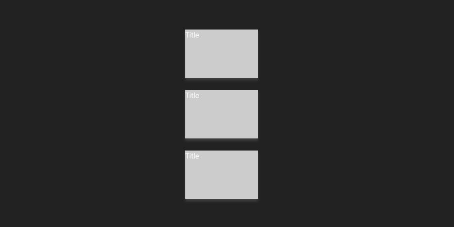
<div class="card">
<div class="box box1">Title</div>
<div class="box box2">Contents</div>
</div>
<div class="card">
<div class="box box1">Title</div>
<div class="box box2">Contents</div>
</div>
<div class="card">
<div class="box box1">Title</div>
<div class="box box2">Contents</div>
</div>
</div>
</body>
<style>
* {
margin: 0;
padding:0;
box-sizing: border-box;
}
html, body {
height: 100%;
}
body {
background-color: #222;
display: flex;
justify-content: center;
align-items: center;
}
.container {
display: flex;
flex-direction: column;
gap:50px;
}
.card {
display: flex;
align-items: center;
justify-content: center;
}
.box {
width: 300px;
height: 200px;
background-color: #fc0;
font-size: 30px;
color: #fff;
}
.box.box1 {
background-color: #ccc;
position: relative;
z-index: 1;
transform: translateX(50%);
transition: transform 0.4s ease-in-out;
}
.box.box2 {
transform: translateX(-50%);
transition: transform 0.4s ease-in-out;
box-shadow: 0 10px 10px rgba(128, 128, 128, .3);
}
.card:hover .box.box1{
background-color: #efe;
transform: translateX(0);
}
.card:hover .box.box2{
transform: translateX(0);
}
</style>
LIST
'프론트엔드 개발자 > CSS' 카테고리의 다른 글
| GRID 완벽 분석하기 grid를 사용해보자 (1) (0) | 2023.04.18 |
|---|---|
| flex-item 속성 flex-grow, flex-shrink , flex-basis 사용하기 (0) | 2023.04.10 |
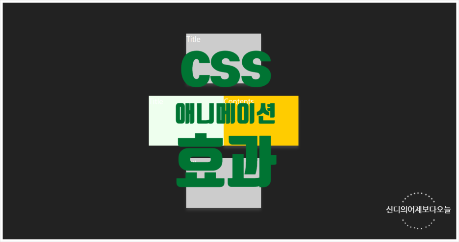
| CSS 애니메이션 효과 _ 카드박스 효과내기(1) (0) | 2023.04.07 |
| CSS _ 애니메이션 다양한 효과넣기(4) (0) | 2023.04.05 |
| CSS _ 애니메이션 연습(3)-(2) 3번의 변형형 (0) | 2023.04.05 |


댓글